

The evolution of Grupo SBF's design system over the course of one year
Introduction
In this article, I will recount my one-year experience (2022 to 2023) enhancing Motriz, a whitelabel, multibrand and multiplatform design system that serves the digital products of Grupo SBF, the holding company responsible for Brazil's largest sports ecosystem.
My challenge involves evolving this design system within a team of only 3 people, with the goal of establishing a unified experience that enables scalability and alignment with the strategic objectives of the business.
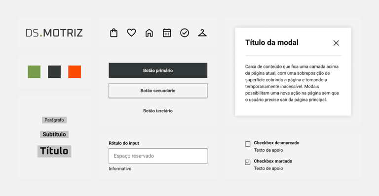
Image 1: Some components and styles available in the Motriz Design System.
A brief explanation about design systems
A design system is a collection of reusable components guided by clear standards that can be assembled together to build any number of applications. Design systems enable the creation of better products faster by making design reusable, and reusability allows for scalability.
"Design System is not a project, it's a product serving other products."
- Nathan Curtis, EightShapes
It's important to consider that a design system has three user groups: designers, who create product interfaces using the designed components; software engineers, who develop these interfaces using pre-coded components; and end users (brand customers), who use these products in their daily lives. In this article, when I use the term "users," I am referring to the group of designer users.
Context
Background
The Grupo SBF's design system had its initial version implemented before my entry into the team. It was initially designed to cater to Centauro, the group's main brand, and Nike of Brazil (Fisia), recently acquired by the group at the time. The components and styles were developed to encompass the visual and experiential aspects for these two brands.
Over time, as the group expanded and acquired new brands such as NWB, FitDance, Studio78, OneFan, and Spoint, there arose a need to adapt the system to also serve these brands. This adaptation aimed to facilitate scalability and establish consistency across the company's ecosystem. My entry into the team coincided with the exact moment when this adaptation was being put into practice.
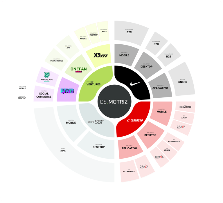
Image 2: Motriz Ecosystem im 2022.
Team composition
Initially, the design system team structure comprised 5 individuals: 2 product designers, 3 web developers, and 1 product manager. We had incredible synergy and many ideas to enhance the product.
However, 4 months later (after the MVP launch), the team was reduced to just 3 members: 1 product designer (myself), 1 web developer, and 1 app developer working only part-time, and this remains our current structure.
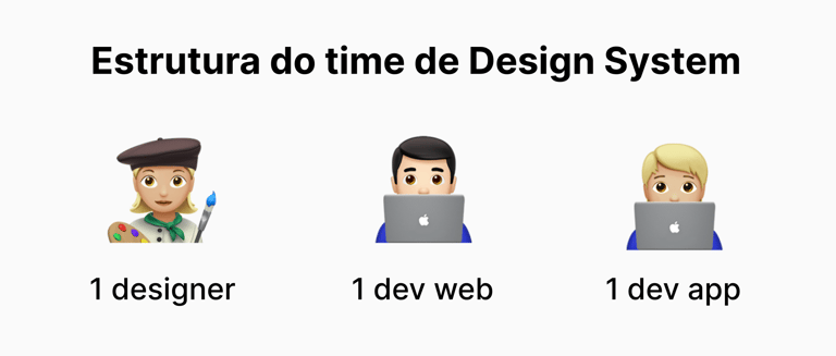
Imagem 3: Design System team structure.
User experience
To understand the context of the design system and its implications within the company, I conducted interviews with product designers and design leaders. Through this, I could diagnose users' pains and needs, gaining insights into their experiences with the system.
I identified significant dissatisfaction and low adoption of the design system, along with the following pain points:
Distancing from the Design System team.
Limited variations and states of components, and challenging customization.
Difficulty understanding certain processes, for example, what to do when the desired component doesn't exist.
Lack of communication about changes and updates to the design system.
Disorganized and outdated documentation.
We established increased satisfaction and adoption, along with the resolution of pain points, as the main OKRs for 2023.
MVP Launch
The Motriz MVP was launched in January 2023, featuring 6 components: button, typography, hyperlink, label, and text input. Initially, these components were made available only in the web/web mobile version (React) and later developed for the app (Flutter).
The design process involved initially sketching the components with a generic look, refining them with developers to assess technical feasibility, and subsequently customizing each component to meet the branding of the SBF Group, which at the time consisted of Centauro, Nike, NWB, and GrupoSBF (internal products).
More information about the process used can be found in this article written by Mateus de Paula, my teammate at the time.

MVP Launch Video of the Motriz Design System. Edited by Mateus de Paula.
MVP of documentation
Simultaneously, we launched our first version of the Motriz documentation with the goal of centralizing our single source of truth and making DS material more accessible to stakeholders and other users not familiar with Figma, the tool where the components were initially documented.
We chose zeroheight because the tool features a CMS where we could create, edit, and delete pages without the need for coding, making it easier to insert and update content. Additionally, there was the possibility of synchronization with key tools used by the team, such as Figma and Storybook, along with excellent templates.
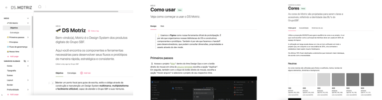
Image 4: Screenshots of the Home, How to Use, and Colors pages in the first version of the documentation, created in zeroheight.
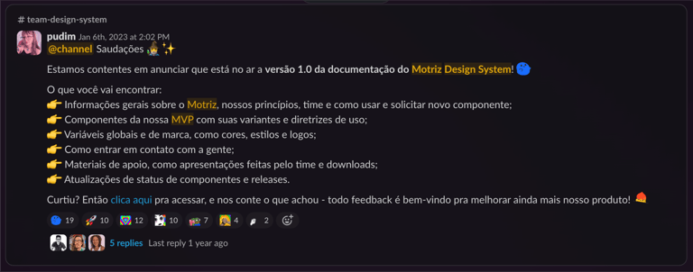

Image 5: Screenshot of the communication about the launch of the Documentation MVP.
Maintenance of component libraries
One of the major complaints from users was the excessive number of Figma libraries. For instance, a designer working in the Centauro tribe had to manually activate up to 4 libraries to access the necessary material for building their prototypes.
Here's how the librarie's composition used to be:
1 web component library (documenting components in desktop version).
1 mobile component library (documenting components in mobile/app version).
1 brand variables library (documenting brand design tokens).
1 global variables library (documenting global design tokens).
This structure led to challenges for users, such as the need to manually activate multiple libraries, making the process cumbersome and increasing the risk of using incorrect components.
To address this issue, I consolidated the web and mobile component libraries with the global and brand variables libraries, reducing it to only 2 libraries per brand (CORE and TEAM components), and from 14 to 8 libraries in total.
With this change, we improved the findability of components and styles by brand and eliminated the need for manual activation of libraries (and thus, the risk of using incorrect components). A library dedicated to facilitating more direct user collaboration—TEAM Components—was also created.
Ultimately, library maintenance became more sustainable, especially as the team had been reduced, and I was the sole product designer.
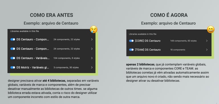
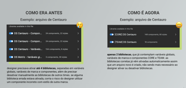
Image 6: Screenshot of the presentation of the library changes to the team, showcasing the before and after.
CORE X TEAM Components
Core Components is the primary library of the DS, containing whitelabel components customized for the brand. Only the DS team can contribute to it.
Team Components is the secondary DS library, containing components created to meet the needs of a specific team, unique to a business unit. Everyone can contribute to it. This library was created to streamline the collaboration process with users. When a user needs a component that doesn't exist in the main brand library, they can build and document the component in the TEAM library (if the component has the potential to be used in other projects within the same brand). Centralizing in a single library is crucial to avoid redundancy in component creation.
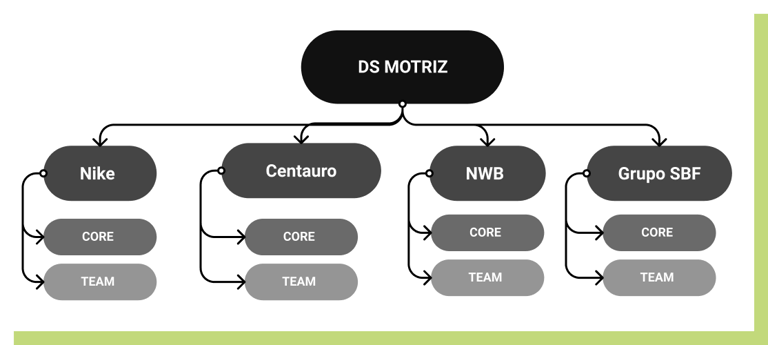
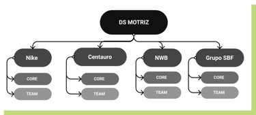
Image 7: Demonstration of how components are distributed in the libraries for each brand.
Design Systems thrive with collaboration
Collaboration is essential for the success of Design Systems. With each user bringing specific skills, we can gather diverse abilities and encourage the exchange of ideas and perspectives, fostering continuous learning and ensuring active participation from multidisciplinary teams in the evolution of the product.
Partnership with developers and product & content designers was embraced early on and became even more critical as the team became leaner. This initiative has been essential ever since to ensure that we can deliver the expected results.
To enhance the collaboration process, it was crucial to establish three main initiatives: the flexibility of the contribution process, critiques of new components, and the inclusion of content design guidelines in the documentation, which I will detail below.
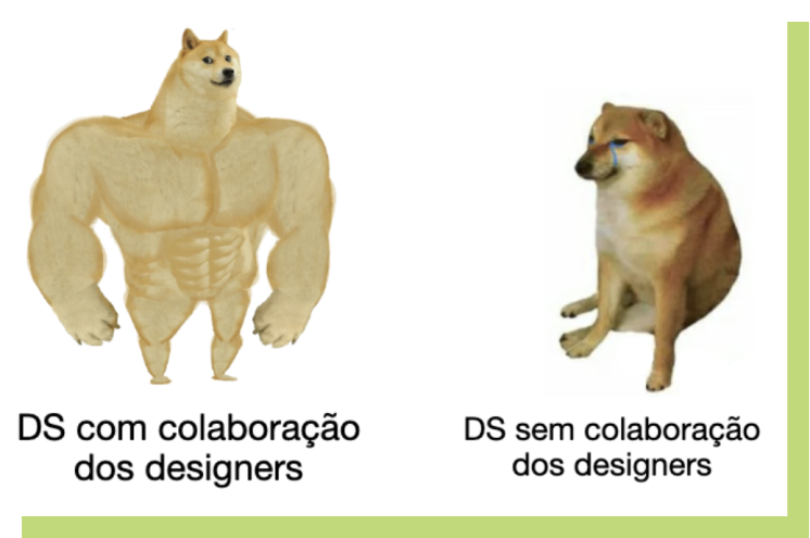
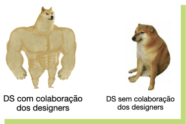
Image 8: Meme about collaboration from user designers for the DS.
1. Flexibilization of the Contribution Process
Previously, if a user needed a component not present in the Design System, they had to request it from the team and wait for it to be built (which could take a considerable amount of time). By redesigning the collaboration process and establishing the Team Components initiative (mentioned in the previous topic), I allowed users greater freedom to contribute components to the design system.

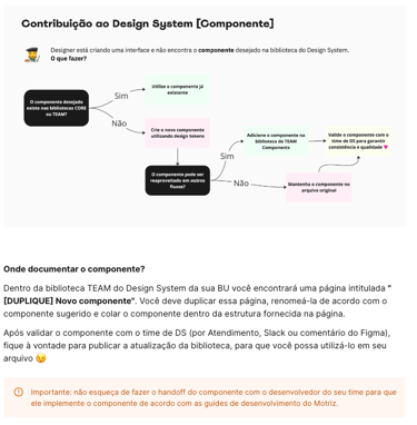
Image 9: Workflow of contribution to the design system.
2. Critiques and Refinement of Components
Another crucial step was to involve users in the early stages of creating new CORE components.
After finishing prototyping any new component, I invite them to a critique session to present the component: its context and need, the designed and customized idea for each brand, its state variations (normal, hover, pressed, etc.), and examples of applications in the brand's products.
This allows us to validate the visual and functional aspects of the component, gather insights, and make adjustments as needed to meet the requirements of each team.
3. Inclusion of Content Design Guidelines in the Documentation
At Grupo SBF, we have a dedicated Content Design team responsible for defining writing guidelines and tone and voice guides for the brands. While these guides were being developed, there was no plan on how to distribute them.
To make these guides available to users, I collaborated with the Content team to develop a strategy to incorporate the material into our Design System documentation.
The process, which involved user critiques using the card sorting method, allowed us to understand how best to organize the content and information architecture in a clear and frictionless manner.
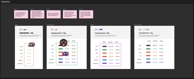

Image 10: Example of a critique for the "Tag" component, with general information and details about all component states. Some comments from the participating users.
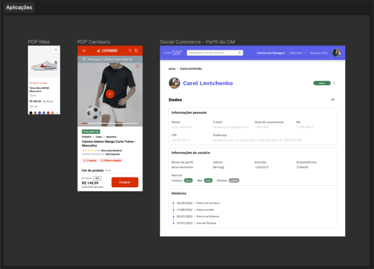

Image 11: Example of the "Tag" component applied in real products from the brands, presented during the critique.
After the critique with the design team, I move on to refinement with the developers to assess the technical feasibility of the component and ensure that it is implemented according to the prototype.
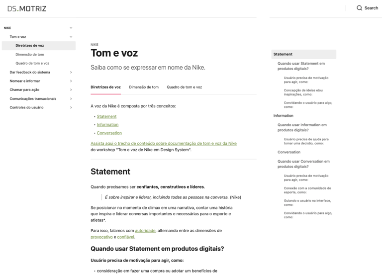
Image 12: Initial Content documentation for the Nike brand.
The decision to bring Content Design guidelines into the Design System documentation made our single source of truth even more robust, resulting in increased satisfaction among user designers and greater synergy between the Content and DS areas.
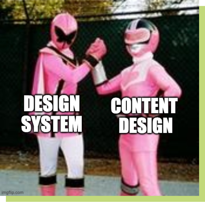
Image 13: Meme about design system and content collaboration.
A new shine for the documentation
Over time, our documentation in zeroheight was updated with more components and styles, becoming increasingly comprehensive and useful for users.
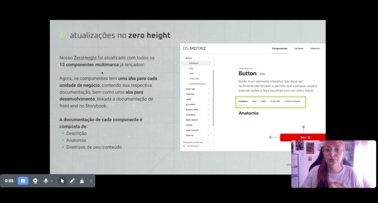
Image 14: Screenshot of the presentation of updates in zeroheight.
Porém, enfrentávamos diversas limitações, pois usávamos a versão gratuita da ferramenta e não tínhamos orçamento para fazer upgrade para a versão com as features necessárias.
Com a versão gratuita era permitido apenas uma documentação, o que não era ideal, considerando que atendíamos diversas marcas com diferentes componentes e estilos. O conteúdo era separado em uma aba para cada marca, e as páginas ficavam muito extensas, pois precisávamos incluir todas as variantes do componente e diretrizes de uso em um só lugar.
Pensando em escalabilidade, a separação por abas se tornaria insustentável com o tempo. Além disso, não era possível incorporar ferramentas, como Hotjar e Google Analytics, o que nos impedia de acompanhar a performance e o uso da documentação.
Migrating to Supernova
Facing limitations with the free version of the tool and lacking the budget for an upgrade, I sought alternative documentation platforms. I discovered Supernova, which offered similar features to the advanced version of zeroheight but at a more affordable price. After negotiating the contract with the design management, I initiated the content migration from zeroheight to Supernova.
This platform switch significantly improved the quality of our documentation, now featuring:
A new homepage with shortcuts to individual documentation for each brand, explanations about the structure, history, tools, processes, and educational materials about the Design System, along with details about our workflow.
Customized documentation for each brand, with dedicated pages containing all styles, components, and materials necessary to build digital products. Additionally, each brand's homepage includes shortcuts to useful information like "How to use," "How to contribute," and "Contact us."
Improved information architecture, separating the anatomy and variants of components from usage guidelines into tabs.
Separation of Content Design guidelines for each brand.
A checklist of accessibility for all components.
Documentation of Design Tokens.
Integration of Google Analytics e Hotjar.
Ability to access the component in Figma and the Storybook repository (engineering documentation) on each component's page.

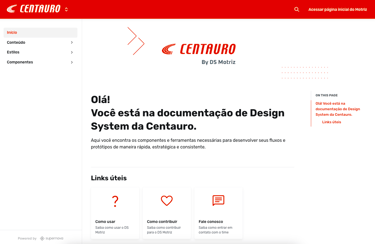
Image 15: Centauro's documentation homepage, customized with the brand's style.

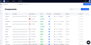
Additionally, the new tool streamlined component management through a table where it's possible to add a description, Figma link, status, documentation status, link to the page, link to the engineering repository, modification date, and more. It also allows managing design tokens, assets, and typography fonts.
Image 17: Screenshots of the Nike app.
Business impacts
Launch of the Nike Brazil App
The use of the design system enabled the creation of the interface and development of the Nike Brazil e-commerce app, which was launched in late 2023. During the final stages of the project, I worked closely with the app team, helping to resolve impediments and supporting the adaptation of the necessary components and styles.
As a result, it was possible to ensure a consistent look & feel and experience in line with the global brand guidelines of Nike Inc., whose approval was necessary for the app's launch.
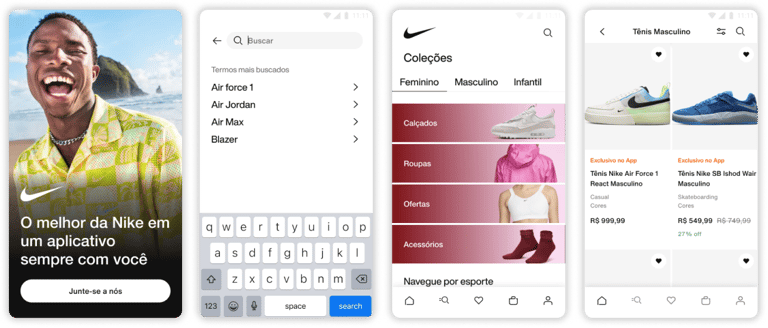
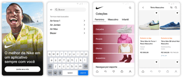
Image 16: Documentation components table for the Centauro brand.
Launch of Spoint app
The Crava app, one of the company's products (which did not yet use the Design System), underwent a rebranding, being renamed Spoint and gaining a new visual identity.
Spoint is an application that helps users convert their movements into benefits. By connecting with other sports apps, such as Strava and Garmin, Spoint identifies records in the connected apps and transforms them into points and exclusive benefits.
By using the design tokens from Motriz, it was possible to adapt the components to the new brand style swiftly, accelerating the update of the product interfaces and time-to-market. In addition to the visual changes, the application of the design system in the app ensured various improvements in usability, information architecture, and accessibility.

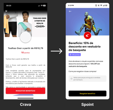
Image 18: Example of the benefits redemption screen of the app, showing before (without DS) and after (with DS styles and components applied).
Image 19: New Landing Page design for the product, showcasing both desktop and mobile versions. With the use of the Design System, the prototyping time was reduced to just 3 hours and 30 minutes.

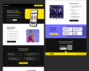
Image 19: Overview of the desktop version prototype for the new Spoint Landing Page, designed by me in Figma.
Conclusion
After a year of intense dedication to developing Motriz, I reflect that it wasn't an easy journey, but the progress was remarkable. We achieved an increase in the adoption of the Design System and addressed the main pain points of users.
Proving the value of the product remains a constant challenge: no matter how comprehensive the material provided is, many people still don't understand what a design system is and what it's for, finding it challenging to use. It's essential to trust the process, be patient, explain as many times as necessary, be available to support teams, and understand that some results will only be noticeable over time.
May Motriz Design System bloom even more in 2024!