

Strategies adopted to enhance Mercado Bitcoin's design system
Intro
In this article, I will discuss my process for creating a design system for Mercado Bitcoin, the largest cryptocurrency platform in Latin America, currently serving over 2 million customers.
My journey with the company spanned from June 2021 to October 2022, with the last 4 months dedicated to enhancing the product's Design System.
Context
I began working in a multidisciplinary squad focused on security, where I was responsible for designing new features for web, mobile, and app platforms (Android & iOS). I worked end-to-end in creating solutions, from discovery to delivery, involving research, ideation, testing, and overseeing development and post-launch activities.
To build the interfaces, I referred to the existing design system at the time, called Apollo. This design system was still in its early stages, with few components and no dedicated team. It was maintained and updated sporadically by product designers themselves, with minimal involvement from the engineering team.
I faced various challenges using Apollo: I often couldn't find the components I needed or wasn't sure which one was correct, as there were multiple versions of the same component. There was an excess of libraries, which were disorganized, with shallow and confusing documentation. Without existing rules and usage guidelines, each designer applied and customized components in the interface in their own way, leading to significant inconsistency in design.
Other issues included a lack of accessibility in components, such as low color contrast and poor legibility of typographic fonts. Additionally, interface implementation was time-consuming, as there were hardly any pre-developed components that could be reused.
As a result, the adoption of the design system was extremely low, and the few users who did use it did so incorrectly. Its true value and utility were not recognized by the company.
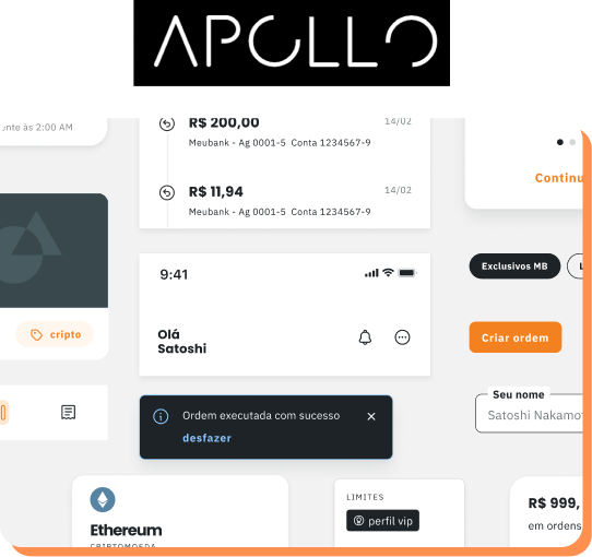
Image 1: Apollo design system logo and some of its components.
The turning point
It was then that a new project emerged in the company: the Rebranding. With changes in identity through new colors, logos, graphic elements, and typography, there was a need for greater attention to maintaining the Design System, whose use would be essential to quickly and consistently update the product experience with the new visual style proposed for the brand.
Image 2: Evolution of the Mercado Bitcoin logo after rebranding, from left to right.
My interest in working exclusively on the design system was already present, so I promptly offered to take on this challenge. After the change in position was approved by my leadership, I began the work with enthusiasm and optimism about the possibilities ahead.
The design system team initially consisted of only me. To assist me in the challenge, another dedicated product designer was hired. So, in addition to the 2 product designers, we also had the part-time involvement of 1 web engineer (front-end) and 1 app engineer (flutter).


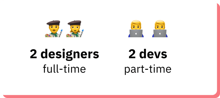

Image 2: Design System team structure.
Starting with the Research
To ensure that the changes in the system were guided by the actual needs of the users, we conducted 1:1 in-depth research with all members of the design team, which at the time consisted of 11 people.
User research was a crucial strategic step in this beginning, as it revealed valuable insights into the system's usage and allowed us to better understand the behaviors, preferences, and challenges the team faced when interacting with it.
Listening to the team
The initial research consisted of 5 questions.
The first question was designed to measure the team's satisfaction with the design system and determine the Customer Satisfaction Score (CSAT). As a result, we obtained a satisfaction percentage of 19%, indicating a high level of dissatisfaction.
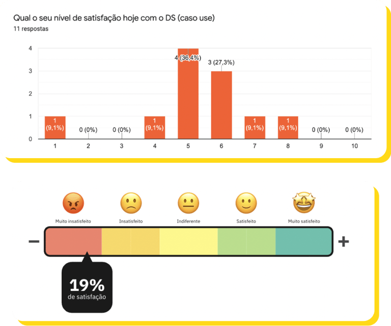
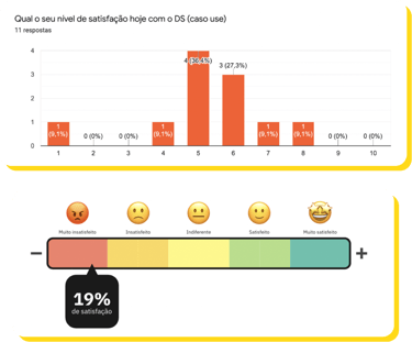
Image 4: Results from the question "What is your satisfaction level today with the DS (if you use it)".
The second question aimed to understand the team's level of knowledge about the Design System, on a scale from 1 to 10. The final average was 5 points, indicating a medium level of knowledge.

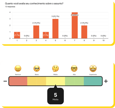
Image 5: Results from the question "How do you rate your knowledge about the subject [Design System]?"
The third question aimed to understand the team's level of knowledge about the Accessibility topic. The majority (78.6%) of designers assessed their knowledge as little to none.
The goal of the fourth question was to gather feedback on both negative and positive aspects that users identified in the design system.
Based on the results, we compiled a top 3 list of the most mentioned points by designers. Among the negatives was the overall organization of files, while among the positives was the team engagement.
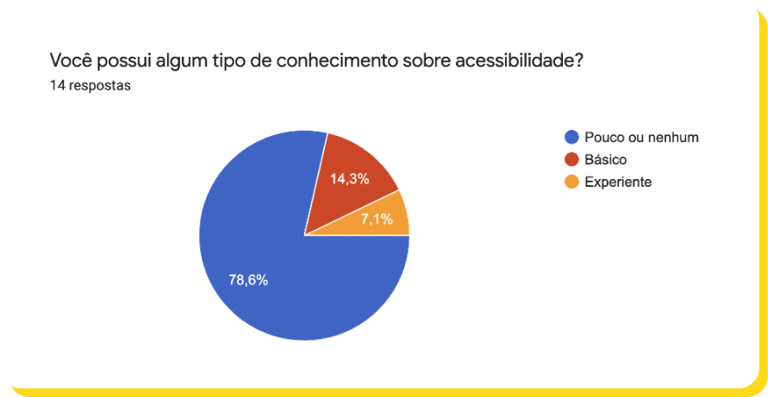

Image 6: Results from the question "Do you have any knowledge about accessibility?"
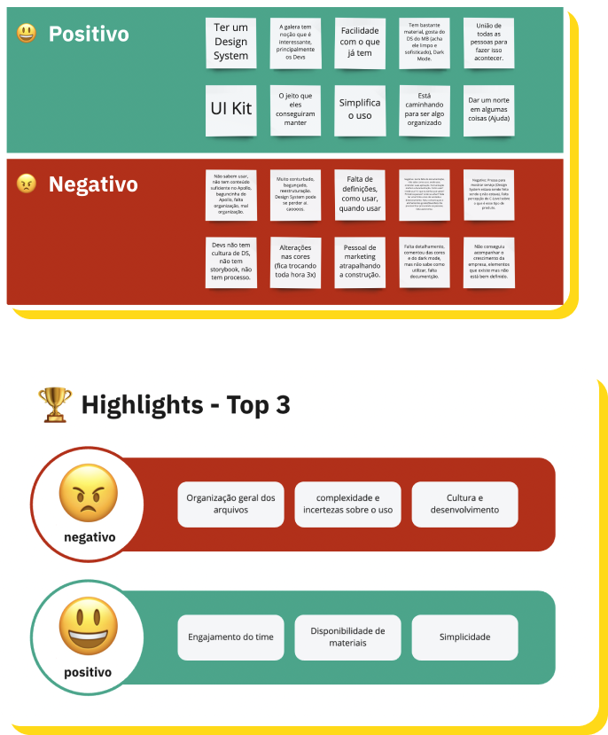
Image 7: Negative and positive points mentioned by designers and a top 3 of the most mentioned negative and positive points.
The last question aimed to discover what expectations designers had regarding the structuring of a team dedicated to the design system.
From the responses, we identified the following keypoints: organization, culture, documentation, and processes.
Understanding tool usage
We employed Desk Research and the CSD Matrix methods to comprehend how the Figma tool was utilized. After discussing with the Figma team and presenting the team's reality, we identified the need for an upgrade to the Organization plan, primarily due to features such as file versioning, advanced organization of teams and projects, and analysis and reports through Figma Analytics, which would be extremely useful to meet the system's needs.
After negotiations with the company's leadership, the plan upgrade was approved. It was what we needed to start "organizing the house." Additionally, the Figma plan review resulted in a cost reduction of $6,000 per year, even with the upgrade to the more expensive plan.
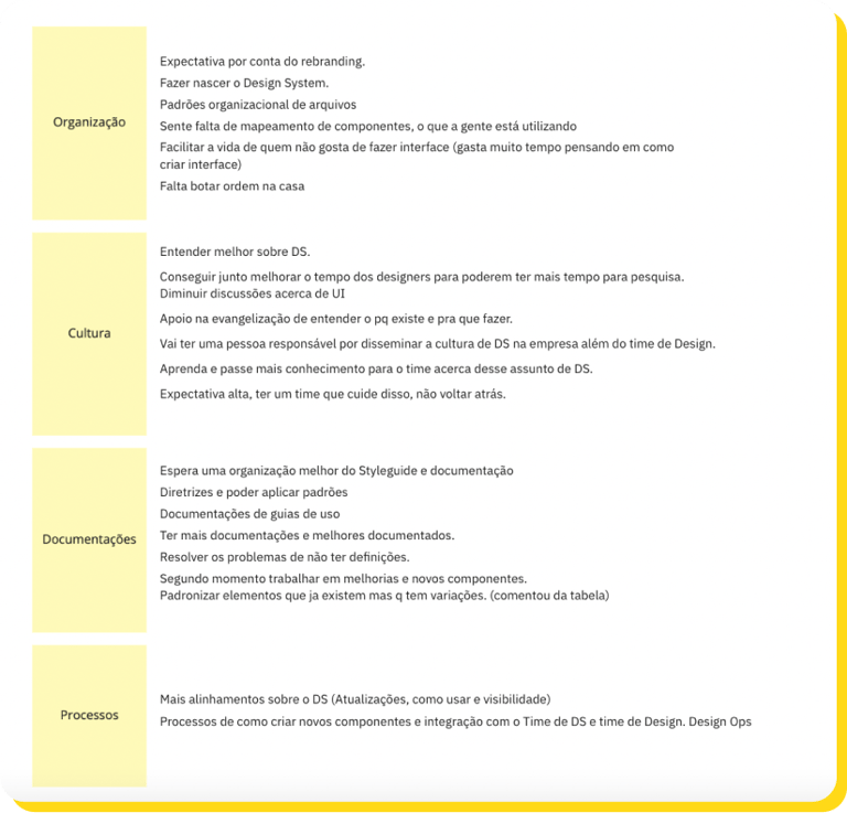
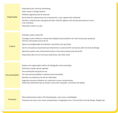
Image 8: Designers' expectations regarding the structuring of a dedicated team for the Design System.
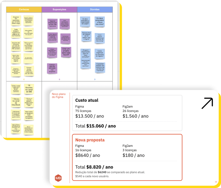
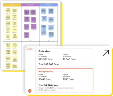
Image 9: CSD Matrix to understand tool usage and a presentation slide to the company's leadership for negotiating the appropriate plan, highlighting the annual savings for the company.
Collaboration
With Figma Organization in place and insights gathered from user research, our next action was to create a new organizational proposal. This involved restructuring teams, projects, libraries, file covers, and standardizing the structure of pages within the file.
To validate the proposal, we conducted critique sessions with the team, which were essential to ensure a more functional and satisfactory organization within Figma.
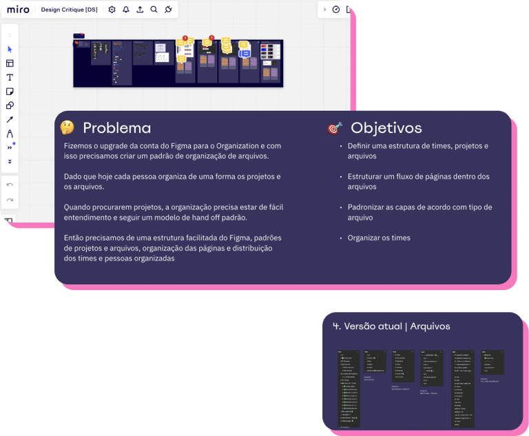
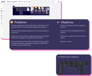
Image 10: Design critique on Miro with users to validate the new file organization proposal, starting with presenting the problem and objectives.
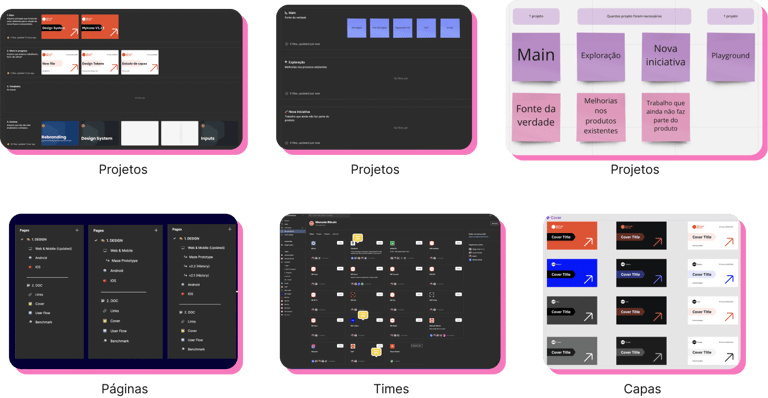
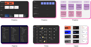
Image 11: Presentation of the new file and team organization proposal in Figma.
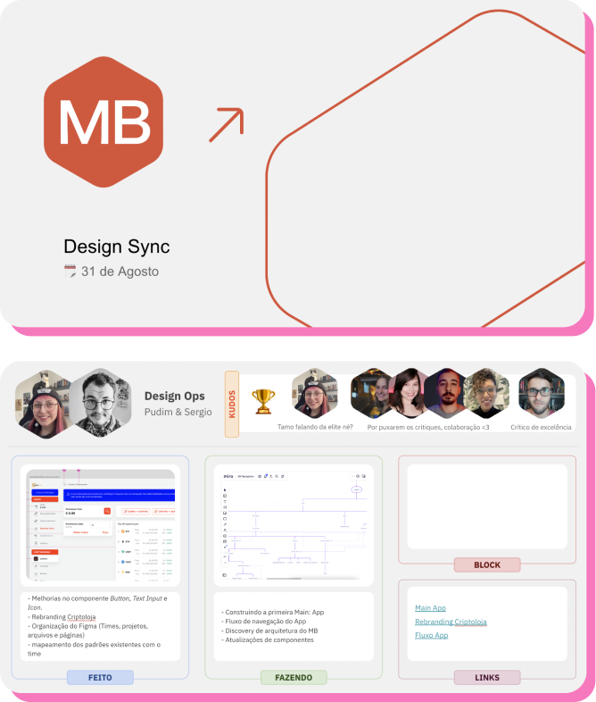
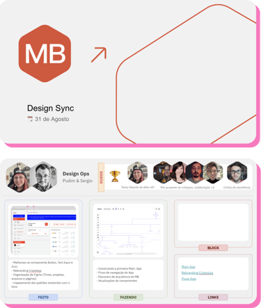
Image 12: Example slide from the "Design Sync" ceremony.
Increasing team engagement
To enhance team engagement, we devised new ceremonies for the UX and Design System teams, divided into:
🗓️ DS Planning: Held every Monday to plan the DS team's activities for the week.
🗓️ DS Daily: Conducted every Tuesday, Wednesday, and Thursday to track progress and address impediments.
🗓️ DS Weekly: Conducted every Friday to review the week's activities and report progress to leadership.
🗓️ UX Sync: Conducted every Wednesday to align the team by presenting completed and ongoing tasks, leadership updates, research and ops, and acknowledgments for colleagues.
In an effort to promote transparency regarding the progress of the new design system, we also implemented the following initiatives:
💡 Slack communications about updates to the Design System.
💡 Creation of a space in the Notion tool for designers to request tasks (such as components, interface reviews, etc).
💡 Development of the roadmap for the MVP of the new design system.
💡 Involvement of designers in creating the new name for the DS, which was renamed Emibê.
💡 Definition of a collaboration guide for users.
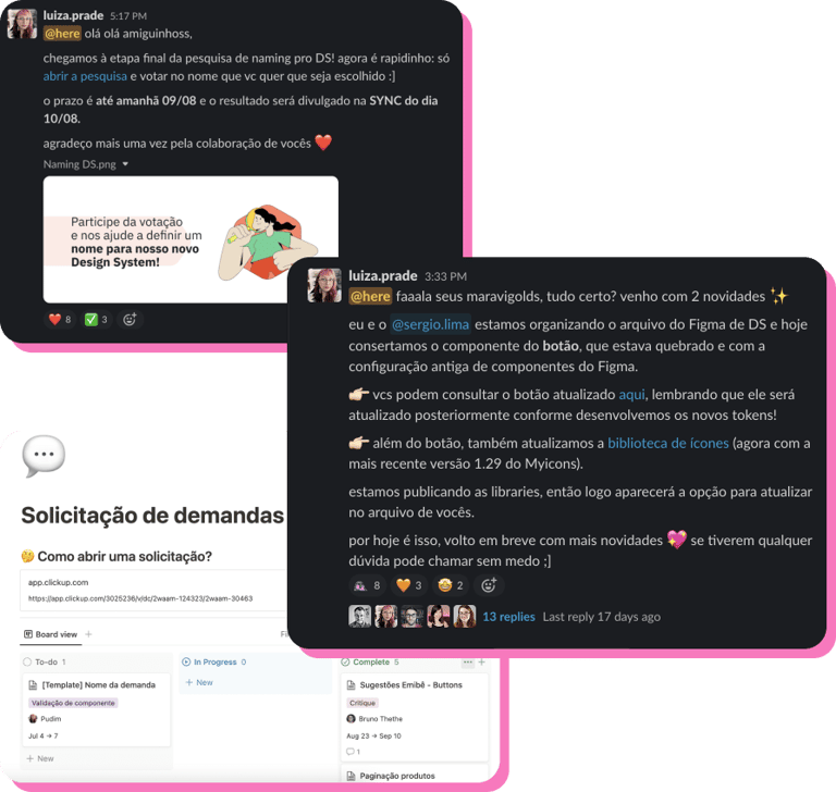
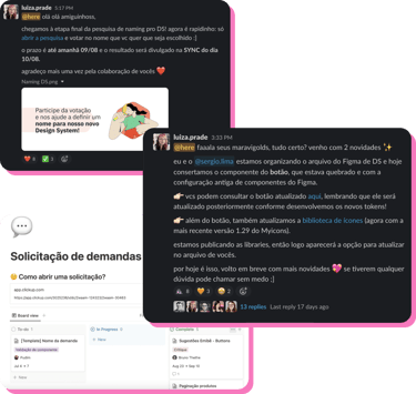
Image 13: Example of communications in Figma involving naming research for the DS, product updates, and demonstration of the space for task requests.
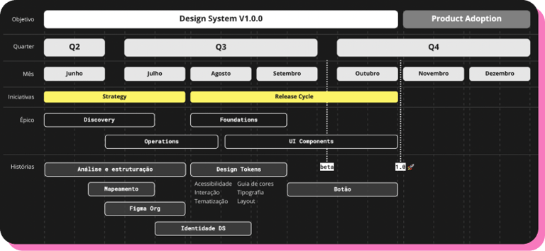

Image 14: Design System roadmap for the year 2022.
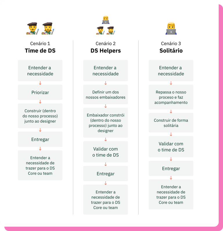
Image 15: MVP of the collaboration guide for the design system, detailing the step-by-step process for building new components considering three different scenarios.
Hands on!
To ensure that all aspects of product design and development were managed efficiently, consistently, and at scale, we began to define and organize our single sources of truth.
We started by mapping all product interfaces across its platforms (web, mobile, and Android & iOS app) to create a component inventory. This allowed us to identify inconsistencies and divergences in experiences across platforms and identify opportunities for improvement and applications of the design system.
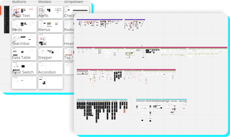

Image 16: Mapping of all product interfaces with the goal of creating a component inventory.
Following that, we began creating design tokens, which were essential for managing the visual style of the brand, optimizing component customization, and ensuring alignment with the development team, who used these same tokens in the code. Additionally, the scalability and theming capability addressed two key business needs: dark mode interfaces and the launch and acquisition of new products and brands.
We created color tokens (light & dark mode), typography, spacing, shadows, rounding, border thickness, opacity, and z-index, all properly documented in a specific file.

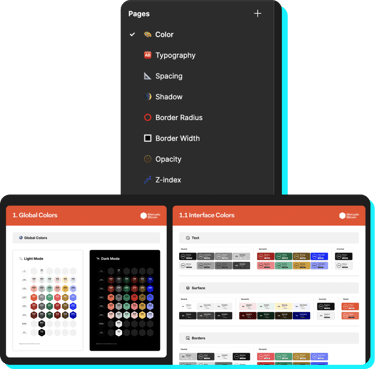
Image 17: Structure of pages in the design tokens file and an example of the organization of color token definitions.
In parallel, we developed a concise process for creating new components, consisting of research, analysis, ideation, and delivery stages, along with a follow-up strategy for Emibê. This strategy is based on measuring user satisfaction every two months, conducting ongoing research, and qualifying ambassadors to strengthen the Design System culture.

Image 18: Component Creation Process.
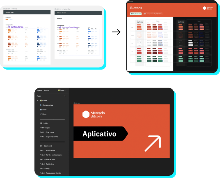
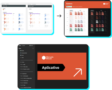
Finally, we refined the components and structured main files in Figma to centralize the product flows considering all platforms, along with a unified library for icons.
Image 19: Before and after refinement of the button component, with new variants and themes, and file organization to centralize all App interfaces.
Impacts
After 4 months of working to improve the design system, the main identified impacts were:
✅ Approximately R$31,000.00 per year in savings with tool revisions and the adoption of Figma Organization.
✅ Greater team alignment with new ceremonies.
✅ Reduction in the number of component libraries from 41 to 2.
✅ Greater freedom for designers to focus on other stages of the design process, such as discovery and research.
✅ Improved file organization.
✅ Increased collaboration among team members.
✅ Greater efficiency and speed in the work of designers, who can build their interfaces with ready-to-use and reusable components and find what they need easily and quickly.
✅ Consistency of the product experience across all distribution platforms.
The end of the journey
In October 2022 I left Mercado Bitcoin to embrace a new challenge.
The main learning I take away (in addition to an expanded understanding of blockchain and cryptocurrencies) is that a design system is, above all, about people. One of the coolest things about working with this type of product is being able to be close to my users and keep them involved and integrated at each stage of the process, continually adapting the system to meet their expectations and needs.
I said goodbye to the company grateful and satisfied with the work I managed to accomplish in such a short period of time (and 100% remotely!). I left the Emibê structure ready for new updates, and, most importantly, a satisfied and engaged team, which started to recognize the value and benefits of the design system in their work. Furthermore, I made friends that I will last a lifetime, especially Sergio Lima, who was not only my partner, but also an incredible mentor!